I began by testing if the physically based render program Luxrender can make a believable simulation of white light passing through a prism.
Unbiased render engines like Luxrender send out many virtual photons and calculate their paths according to physical laws, and as the ray-tracing algorithm includes colour dispersion, it should work.
Experimentum Crucis
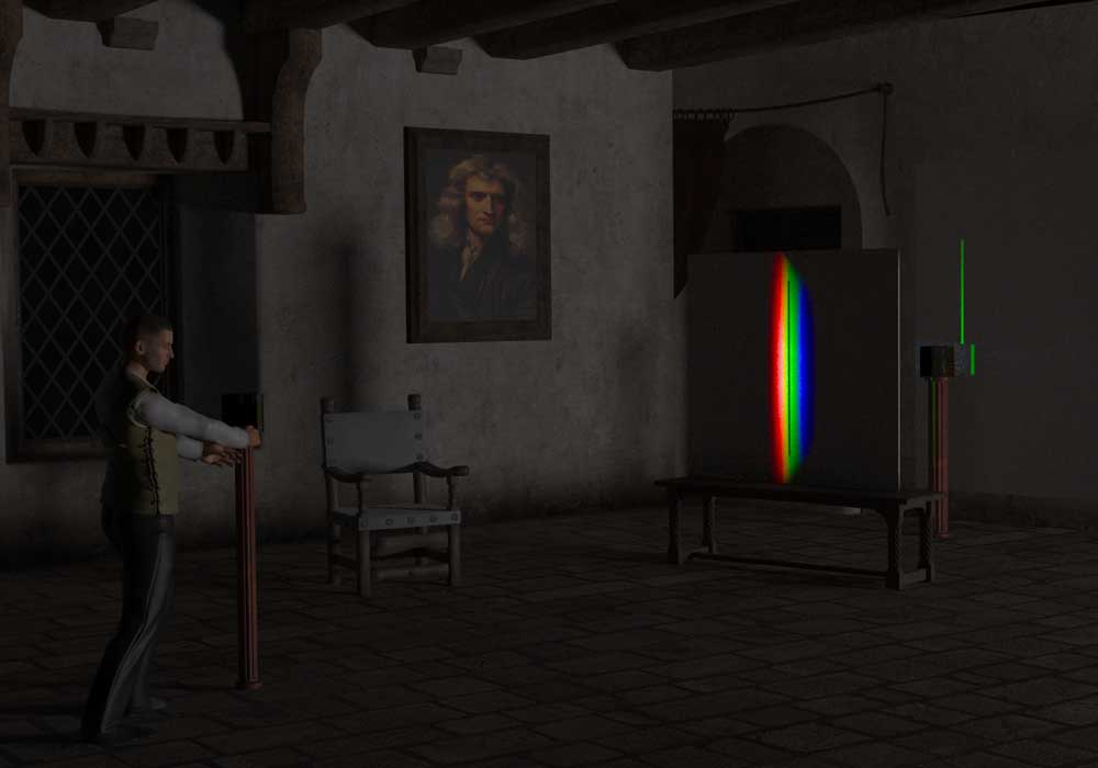
Adding a second prism gives us Isaac Newton’s ‘Experimentum Crucis’: one of a series of experiments performed by Newton in 1666 and reported in a letter to the Royal Society in 1671 (1), showing how white light is composed of a range of colours separable by a prism.
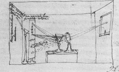
Newton then demonstrated the colours were a property of the light, not the prism, by using a slit to isolate an individual colour from one prism, and passing it through a second where no further separation of colours occurs – the second prism just refracts the single colour to one side. Here is Newton’s own drawing of his two-prism experiment.
Virtual set-up and approximations
My distances and prism sizes are not accurate, but the simulation still works. Also, Newton used the sun as a light source: passed through a slit before the first prism or focused through a lens. By contrast, my source is a small rectangular surface radiating in all forward directions followed by a collimating tunnel.
If the real or simulated light source is too ill-defined or unfocused, the separation in the spectrum can look superficially reasonable, but actually comprise several fuzzy overlapping spectra. As a result, running without the collimator caused the green band to split into further colours. That said, it’s worth remembering that while Newton reported seeing seven colours, the actual spectrum is a continuum of wavelengths, so a single colour will in fact be made of a range of further dispersible shades – we just don’t discern it.
Results
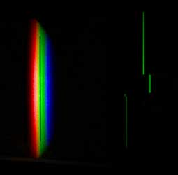
Here is a close-up of the isolating slit and the green spectral ‘line’ deviated but not dispersed by the second prism. I’ve also in this picture turned out the background light used solely for dramatic effect in the first picture.
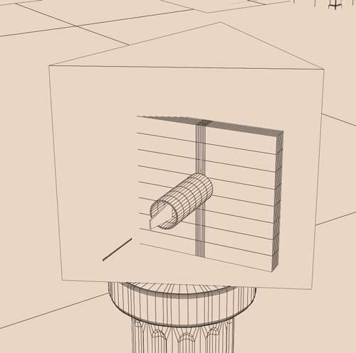
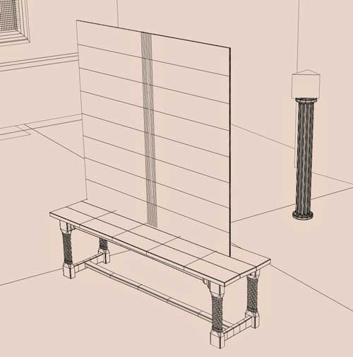
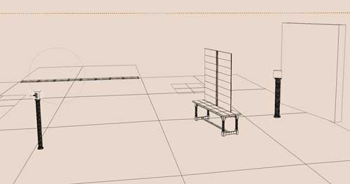
And here are wireframe pics of the layout (scene created in Poser and linked to Luxrender via Reality):
Other Observations
An interesting feature of this type of modelling is the need for a so-called Tone Mapping process. This requires the multiple wavelengths to which the ray-tracing maths is applied to simulate dispersion are translated into the red, blue, and green (RGB) that the computer monitor can display.
This sort of progam is limited as a virtual optical bench. Luxrender cannot, for example, calculate the quantum probability amplitudes necessary to simulate interference as seen in the double slit experiment.
References
(1) doi: 10.1098/rstl.1671.0072 Phil. Trans. 1 January 1671 vol. 6 no. 69-80 3075-3087
Also of interest:
")